 |
Jaws 1975: Clever design here, The isolated use of the image in the centre really adds an air of gravitas and foreboding. |
 |
Star Wars 1977: Such an intrinsically 70's design and worthy of a place in any retro mood board. |
 |
Walk the Line 2005: Very Classic, almost Tex-Mex design. |
 |
Pulp Fiction 1994: Early 90's grunge design at it's very best. One of my favourite movies and one of my favourite movie posters. |
 |
American Beauty 1999: A perfect example here of how simplicity can often produce the most memorable results. |
 |
Casablanca 1942: As classic a design as you're ever likely to see. I just love the trends in design of the first half of the 20th century. |
 |
Perfume 2006: Great use of light and colour isolation here for an extremely effective design. |
 |
Planet of the Apes 1968: Very clever Two-tone design here and the use of text to make up the image is a technique that was very ahead of it's time. |
 |
Star Wars Episode I 1999: Very neat minimalist design on this piece and the intelligent manipulation of the shadow eludes to the movies story in a nice subtle way. |
 |
The U.S. vs. John Lennon 2006: Every aspect of the movies title is captured here in a beautifully simple design. Very clever work. |
 |
The Thing 1982: Lots going on in this piece, very effective though. The old fashioned design works well and is almost reminiscent of the old 1930's horror movie posters. |
 |
Scarface 1983: This hugely iconic, often replicated two-tone design has become one of the most recognisable designs of all time. |
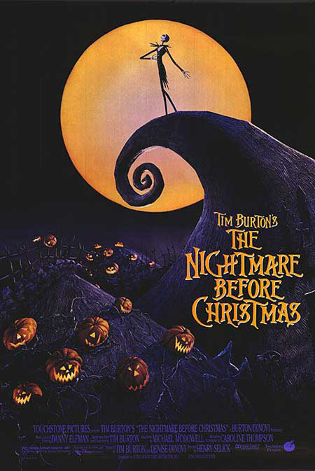 |
Tim Burton's The Nightmare Before Christmas 1993: The art work on this entire movie was exquisitely done and the poster is no exception. |
 |
Sweeney Todd 2007: Incredibly eery feel to this one. Great use of light and shadow and colour isolation. |
 |
Alfred Hitchcock's The Birds 1963: Another fantastic example here of how simplicity can often hold the key to a highly effective design. |
 |
V for Vendetta 2006: Love this, quite quirky, vector design. Great colour scheme too. |
 |
Forrest Gump 1994: Lovely typography, beautiful composition. This simple design never fails to conjure up images for me of a wonderful film. |
 |
Jurassic Park 1993: This, logo in the centre of a plain, dark background style of design always serves well to imply that there is something big on the way and that was certainly true of Jurassic Park. |
 |
Clockwork Orange 1971: To succeed in creating such a creepy feel in such a sparse design is an amazing feat and that focused stare always stirs my gutty wuts! |
 |
The Silence of the Lambs 1991: Perhaps the most iconic of them all. The image of Jodie Foster with the death's-head hawk moth covering her mouth is extremely powerful and instantly recognisable. The pattern on the back of the moth is not its natural markings It is, in fact, Salvador Dali's "In Voluptas Mors", a picture of seven naked women made to look like a human skull. So there you have it, my case for the inclusion of select movie posters into the art world. Did I miss any out? Comment below if you think there are more movie posters worthy of a place on gallery walls. |